Spectrum Analysis and Periodic Structure
Chapter 13 developed time domain methods—ARIMA models that exploit autocorrelation for forecasting.
This chapter takes the complementary view: frequency domain methods ask what periodic components are present.
| Perspective | Central Question | Emphasis |
|---|---|---|
| Time domain | How does the past predict the future? | Decision support |
| Frequency domain | What cycles and rhythms structure the process? | Scientific understanding |
Many natural and human systems exhibit periodic behavior:
The frequency perspective reveals these periodicities directly—as peaks in the spectrum.
The spectrum \(f(\lambda)\) decomposes variance across frequencies:
\[\sigma_X^2 = \int_{-\pi}^{\pi} f(\lambda) \, d\lambda\]
Why does Fourier analysis work so naturally for time series?
Complex exponentials \(e^{i\lambda t}\) are eigenfunctions of the back-shift operator:
\[\mathcal{B}^s e^{i\lambda t} = e^{i\lambda(t-s)} = e^{-i\lambda s} \cdot e^{i\lambda t}\]
Any linear, time-invariant operation (filtering, smoothing, differencing) acts simply on sinusoidal components—multiplying each by a constant.
This is why decomposing into frequency components is the natural coordinate system for stationary processes.
The spectrum and autocovariance contain the same information:
\[f(\lambda) = \sum_{h=-\infty}^{\infty} \gamma(h) e^{-i\lambda h}\]
\[\gamma(h) = \frac{1}{2\pi} \int_{-\pi}^{\pi} f(\lambda) e^{i\lambda h} \, d\lambda\]
They are Fourier transform pairs. The ACF tells us about temporal dependence; the spectrum tells us about periodic structure. Same reality, different views.
Given data \(X(0), X(1), \ldots, X(T-1)\), how do we estimate \(f(\lambda)\)?
The periodogram is the natural sample estimate:
\[I(\lambda) = \frac{1}{T} \left| \sum_{t=0}^{T-1} X(t) e^{-i\lambda t} \right|^2\]
This is proportional to the squared magnitude of the finite Fourier transform of the data.
The periodogram measures how well a sinusoid at frequency \(\lambda\) fits the data.
At the Fourier frequencies \(\lambda_j = 2\pi j / T\), the periodogram can be computed efficiently via the Fast Fourier Transform (FFT).
The periodogram is asymptotically unbiased:
\[E\{I(\lambda)\} \to f(\lambda) \text{ as } T \to \infty\]
But it is not consistent—its variance does not shrink:
\[I(\lambda) \sim f(\lambda) \cdot \frac{\chi_2^2}{2} \quad \text{for } \lambda \not\equiv 0 \pmod{\pi}\]
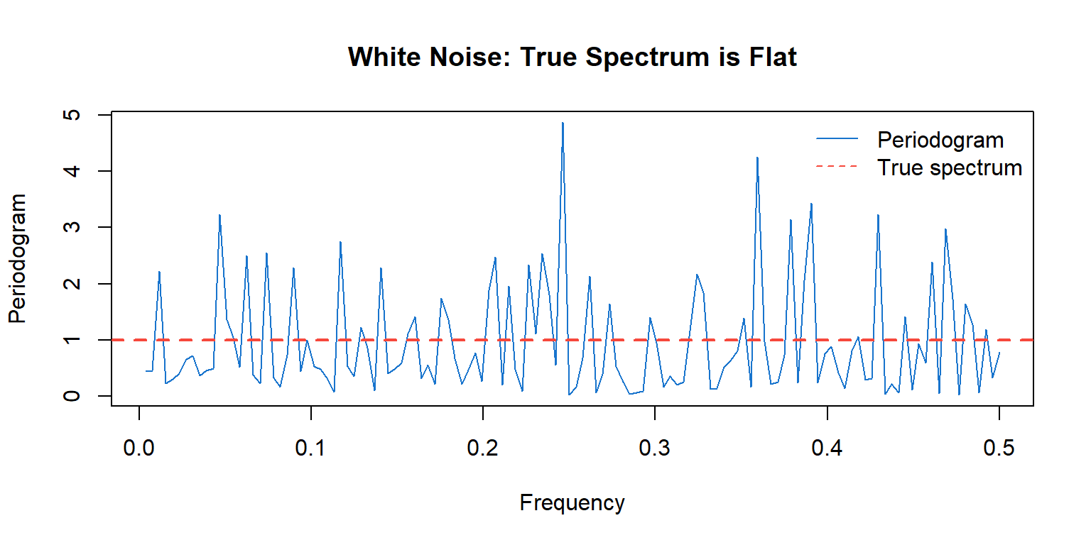
The periodogram fluctuates wildly around the true spectrum, even with large samples.
Figure 1: Raw periodogram of white noise: high variability around flat true spectrum
The true spectrum (red dashed) is constant, but the periodogram (blue) varies wildly.
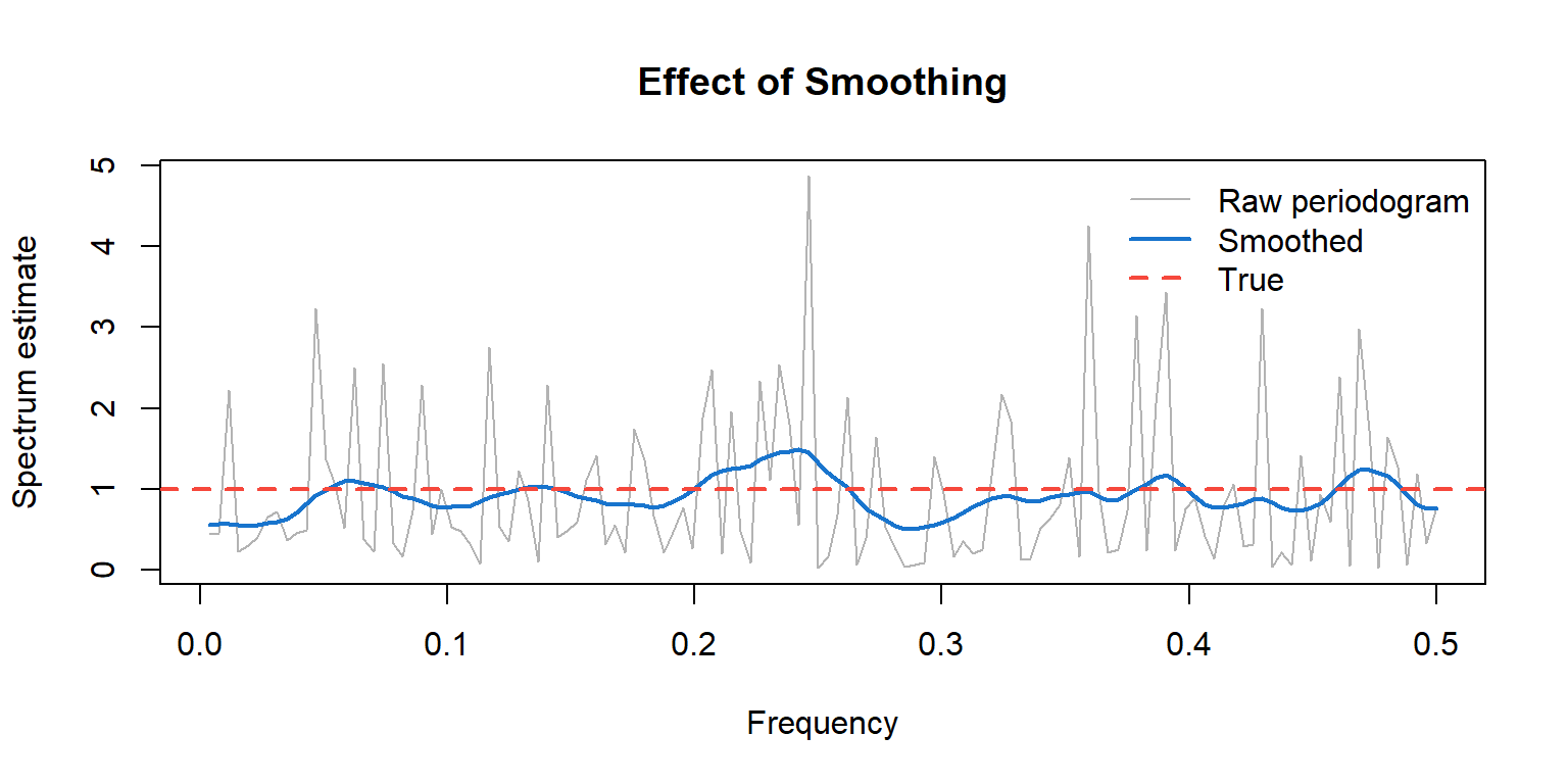
To reduce variance, we smooth the periodogram by averaging over nearby frequencies.
\[\hat{f}(\lambda) = \sum_j W_j \cdot I(\lambda_j)\]
where the weights \(W_j\) form a smoothing kernel centered at \(\lambda\).
More averaging → lower variance, but also lower resolution (bias).
| More smoothing | Less smoothing |
|---|---|
| Lower variance | Higher variance |
| Blurs nearby peaks | Resolves nearby peaks |
| Risk: miss narrow features | Risk: spurious peaks from noise |
The bandwidth \(\beta\) controls this trade-off.
For a consistent estimator, we need \(\beta \to 0\) but \(\beta \cdot T \to \infty\) as \(T \to \infty\).
A common choice is the modified Daniell kernel—a moving average over adjacent frequencies.
In R, stats::spec.pgram() uses this approach:
spans: widths of Daniell smoothers (can be repeated for more smoothing)taper: proportion of data tapered at ends (reduces leakage)Figure 2: Smoothing reduces variance while preserving the overall shape
When examining a spectrum estimate:
For the smoothed spectrum estimate with \(\nu\) degrees of freedom:
\[\frac{\nu \hat{f}(\lambda)}{f(\lambda)} \sim \chi_\nu^2\]
This gives a confidence interval for the true spectrum:
\[\left[ \frac{\nu \hat{f}(\lambda)}{\chi_{\nu, 1-\alpha/2}^2}, \; \frac{\nu \hat{f}(\lambda)}{\chi_{\nu, \alpha/2}^2} \right]\]
Note: the interval is multiplicative, not additive—it’s the same width on a log scale at all frequencies.
Plotting \(\log \hat{f}(\lambda)\) has advantages:
R’s stats::spec.pgram() uses log scale by default.
For ARMA processes, we can derive the theoretical spectrum from the model parameters.
This connects Chapter 13’s models to Chapter 14’s frequency view.
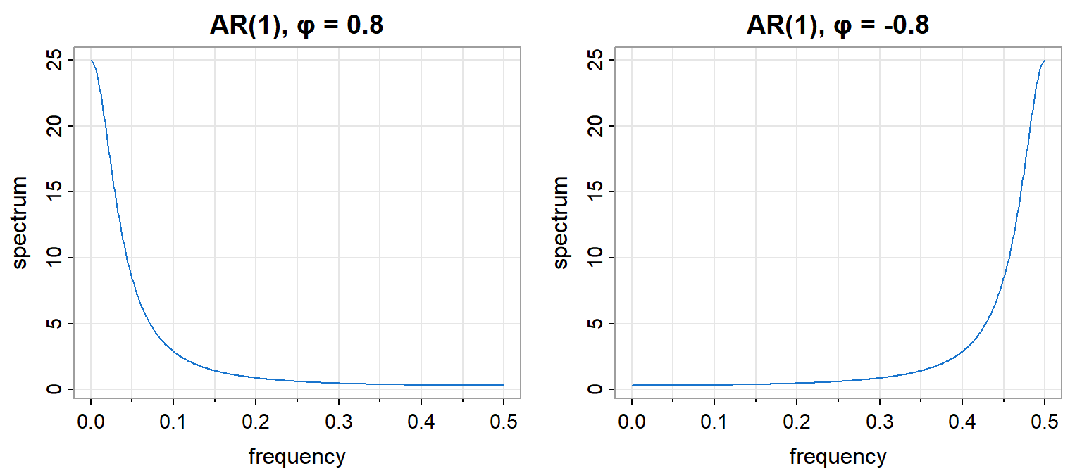
Key insight: AR processes have peaks where roots of \(\phi(z)\) are near the unit circle.
For AR(1): \(X(t) = \phi X(t-1) + W(t)\)
\[f(\lambda) = \frac{\sigma_W^2}{|1 - \phi e^{-i\lambda}|^2} = \frac{\sigma_W^2}{1 - 2\phi\cos\lambda + \phi^2}\]
For MA(1): \(X(t) = W(t) + \theta W(t-1)\)
\[f(\lambda) = \sigma_W^2 |1 + \theta e^{-i\lambda}|^2 = \sigma_W^2 (1 + 2\theta\cos\lambda + \theta^2)\]
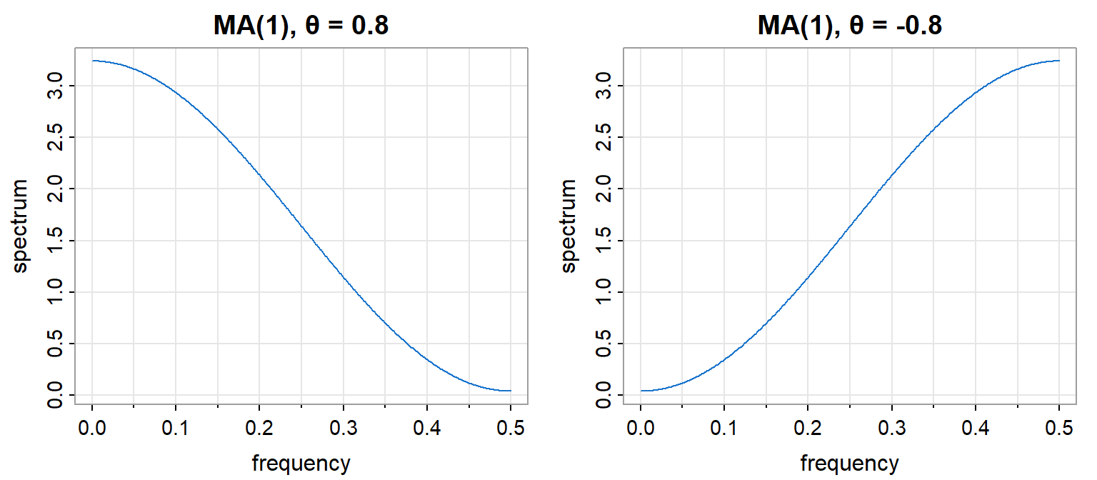
The MA(1) spectrum is the inverse pattern of AR(1) with the same parameter.
AR(2) with complex roots produces a spectral peak at a frequency determined by the roots.
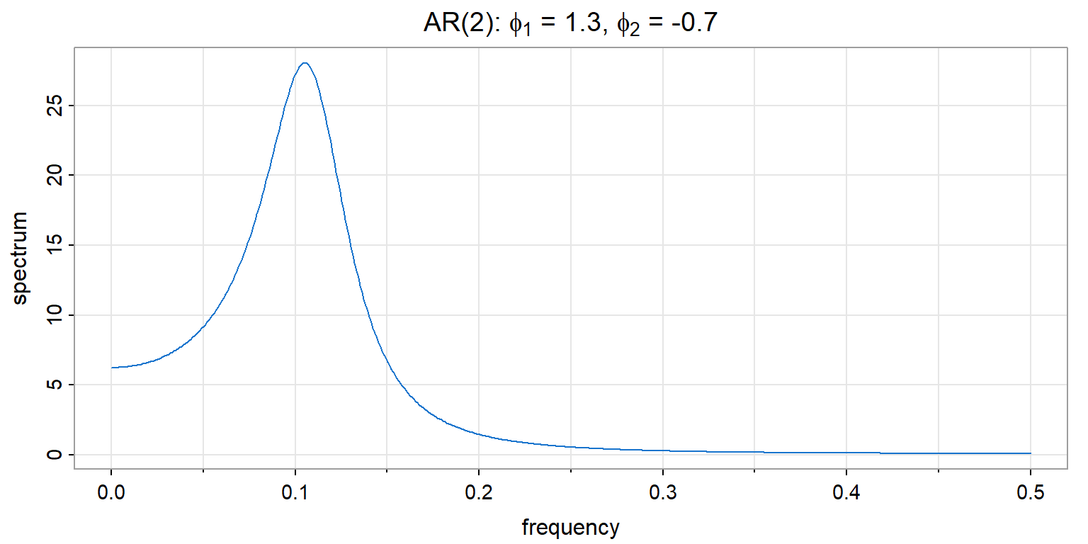
Figure 5: AR(2) with complex roots: peak indicates quasi-periodic behavior
This is the recruitment series model from Chapter 13—the spectral peak corresponds to the damped oscillation in the ACF.
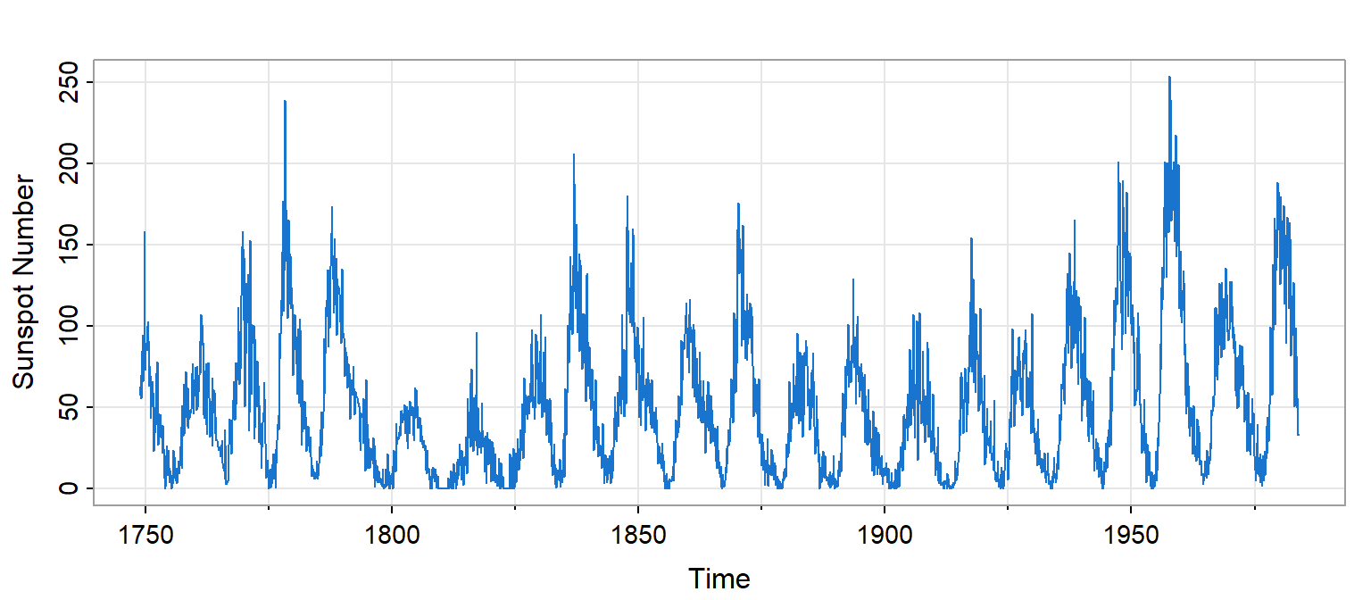
Figure 6: Monthly sunspot numbers show quasi-periodic behavior
As we saw in Chapter 12, sunspots exhibit an approximately 11-year cycle—but with substantial variation in both amplitude and period.
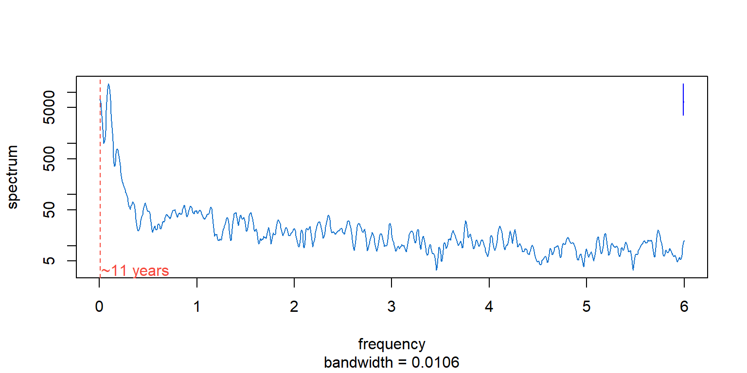
Figure 7: Sunspot spectrum: dominant peak near 11-year period
The dominant peak corresponds to a period of approximately 11 years (132 months).
The spectrum reveals:
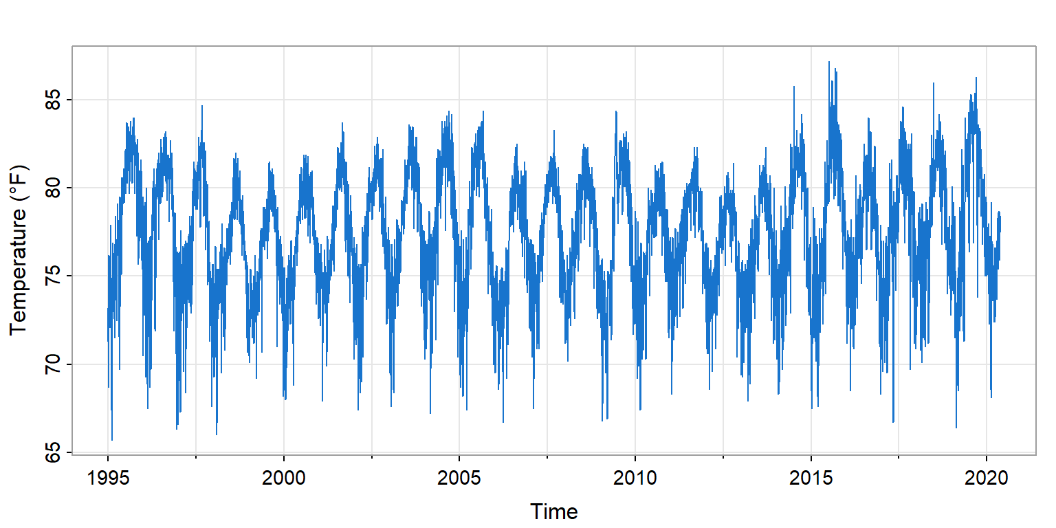
Daily temperature data from Honolulu exhibit a clear annual cycle—the earth’s orbit imposes a 365-day periodicity.
Question: How much of the total temperature variance is explained by the annual cycle?
Figure 8: Honolulu daily temperatures (1995-2020) show clear annual cycle
The annual cycle is visible but embedded in day-to-day variation. Mean temperature is 77°F with standard deviation 3.4°F.
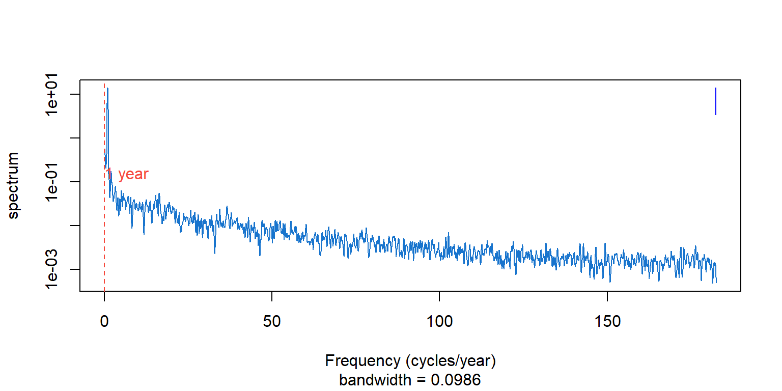
Figure 9: Honolulu temperature spectrum: sharp peak at annual frequency
The spectrum answers: “What fraction of variance is at frequency \(\lambda\)?”
For temperature data:
This quantifies what the time plot shows qualitatively—the annual rhythm dominates.
When we have two time series, we can ask: at which frequencies do they move together?
Coherence measures the correlation between two series at each frequency.
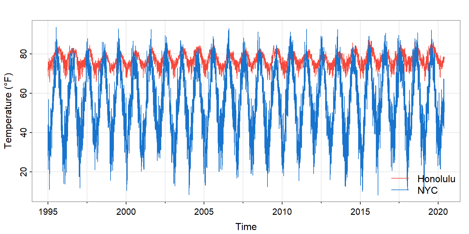
Figure 10: Daily temperatures at Honolulu and New York City (1995-2020)
Both cities show annual cycles, but NYC has much larger amplitude (mid-latitude seasons) and more day-to-day variability.
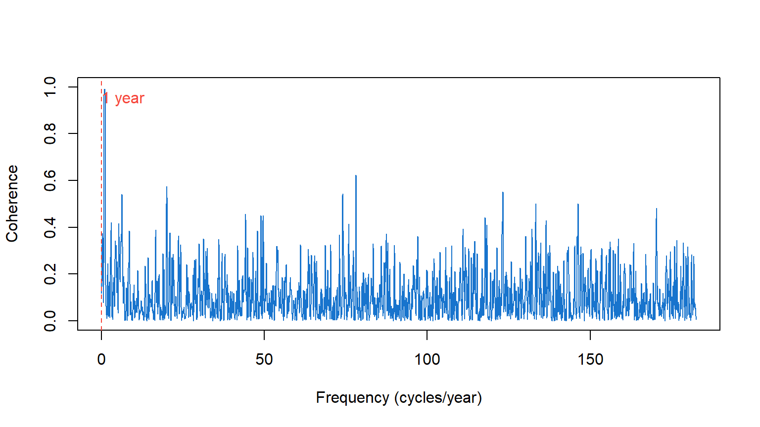
Figure 11: Coherence between Honolulu and NYC temperatures
At the annual frequency: Coherence ≈ 1
At higher frequencies: Coherence ≈ 0
Coherence identifies which periodicities are shared between series.
| Time Domain | Frequency Domain |
|---|---|
| ACF, PACF | Spectrum |
| AR, MA, ARIMA models | Spectral peaks, bandwidth |
| Forecasting | Identifying cycles |
| “How does past predict future?” | “What periodic structure is present?” |
These are equivalent descriptions—Fourier transform pairs—but illuminate different aspects.
Time domain excels for forecasting and short-term dependence modeling.
Frequency domain excels for identifying periodicities and understanding cyclic mechanisms.
Best practice: Use both—they reveal different aspects of the same reality.
Consider sunspots:
Consider global temperature:
When performing spectrum analysis:
Plot the time series first: Look for obvious periodicity, trend, level shifts
Choose appropriate smoothing: More data → can use narrower bandwidth
Use log scale: Constant confidence band width; see structure across magnitudes
Identify peaks: Convert frequency to period; interpret physically
Consider ARMA spectra: Do peaks match expected model structure?
Connect to time domain: Do ACF patterns match spectral features?
Generate 256 observations of Gaussian white noise using stats::rnorm():
stats::spec.pgram(..., spans = NULL).spans = c(7, 7). How does the estimate improve?Using the SOI data (astsa::soi):
Using the sunspot data (astsa::sunspotz):
spans = c(3, 3) (narrow bandwidth).spans = c(15, 15) (wide bandwidth).For the HNL-NYC temperature data:
“The spectrum and ACF contain the same information.” Why might the spectrum be more useful for some questions?
You observe a spectral peak but aren’t sure if it’s real or noise. How would you assess this?
When would you prefer time domain methods over frequency domain methods for the same data?